
After we’d seen the Klee exhibition at Tate Modern we had some dinner (midday meal where I come from) and then went in to see the retrospective of works by the Brazillian artist, Mira Scehndel. I’d been keen to see it ever since I’d read the review by Eirene of A Place Called Space. She was very enthusiastic about it and her enthusiasm was infections. And the pictures of the works on her blog looked interesting. The exhibition finished on 19 January, so it was our last chance to see it. And a combined ticket with the Klee exhibition only cost an extra £1 to see the Schendel (we only have one membership of the Tate, and although it allows both of us in to see the priced exhibitions in Liverpool, we have to buy a ticket for one of us in London.
Just about all of the reviews I’ve read of the exhibition seem to start with the phrase “I’d never heard of Mira Schendel”, and that was true for me to, at least before I read Eirene’s blog post. But every reviewer expressed great enthusiasm for what they’d seen at the Tate. Schendel was extremely talented. She was born in Zurich of Jewish heritage, and brought up in Italy before the war. To cut a long story short, to escape from the fascists and Nazis she moved to Yugoslavia where she married a Yugoslav national. After the war she emigrated to Brazil where she spent the rest of her life.

Untitled (1963)
In her early days in Brazil she too poor to buy proper paint or rent a studio, so she worked on her kitchen table using whatever materials she could afford or her hands on to create her works. Later she worked as a commercial graphic artist.
Like the Klee exhibition, the works were shown in chronological order. The first few rooms were dominated by fairly large canvases that clearly showed the influence of Klee and Giorgio Morandi – the Italian artist renowned for his still lives of bottles and vases. Very apt for us as we’d been to the Klee exhibition that morning and to the Estorick Collection in Islington, which specialises in Italian 20th Century art and has a number of paintings, drawings and prints by Morandi.
As is often the case with these exhibitions, photography wasn’t allowed so I’ve pinched a few pictures from here and there to illustrate this post. But there is an exhibition catalogue available for anyone interested in her work and quite few pictures viewable via an Internet search. Unfortunately, I couldn’t locate any of my favourite paintings from this early period on the net.
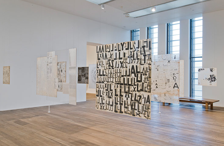
Moving through the galleries we could see how she started to develop an interest in incorporating words and letters into her paintings. She also developed an interest in sculpture creating 3-D objects from rice paper.

She also began to experiment with using light to create shadows bringing these approaches together to create what for me were some of the most fascinating and interesting pieces in the exhibition. She sandwiched Letraset type letters, numbers and symbols between sheets of rice paper in various patterns and arrangements and suspended them from the ceiling so that the light shone through them. They could be viewed from different positions and created shadows on adjacent surfaces. This interplay of light and shadows has always interested me.

Graphic Object (1967–8)
There was a large installation were several of these panels were suspended from the ceiling. There was no colour – the nature of the materials meant that they were monochrome. But that didn’t matter, there was plenty of interest in the patterns, the dark and shade, the gradations of black and grey created by the different densities of the text and the interplay between the different pieces. It would have been nice to get in amongst them but, perhaps understandably, this wasn’t allowed. Nevertheless a very interesting and, to me, effective display.

(Photo by Martin Beek from Flickr here)
The use of letters became a major theme for Schendel and there were a significant number of such works in the exhibition, sandwiched between rice paper and Perspex.

Untitled (From the series Graphic Objects, 1972)

Untitled (Disks) 1972
A variation on this approach resulted in works where she had punched holes in paper, again creating patterns and, in some cases, 3 D effects.
In one room there were a number of books that she had created from semi-transparent rice paper graphics where she had used letters and graphics to create effects that changed by turning through the pages – almost like a flicker book animation. Visitors couldn’t flick through the books themselves, or indeed touch them, but the gallery had reproduced the books as an ipad app so visitors could experience the effects.
With such a dazzling collection of beautiful and stimulating artworks, it seems unfair to pick out a favourite. But I have. Displayed in one of the rooms about towards the end of the exhibition was a work consisting of a mass of nylon threads hanging from the ceiling, which was accompanied by a text from the Old Testament ‘Book of Kings’ inscribed on the wall. A very simple work but incredibly effective. It was like peering through mist and and anyone standing at the opposite side almost disappeared, appearing like a ghostly phantom.

Still Waves of Probability (Old Testament, I Kings 19) (1969)
Originally, created for the 1969 Venice Biennale, I don’t think I can’t describe it any better than Laura Cummings of the Observer in her review
A great deluge of nylon threads drops down from the ceiling, splashing on the floor like the waves of an ocean, a girl’s soft curls, or the upward spatter of pouring rain. The vision is perfectly simple and completely mesmerising
I have to agree with that.
Moving on through the final few rooms there were works from the later part of her career when she changed direction artistically. She adopted new techniques, such as spray painting and the use of gold leaf. And produced some simple, three dimensional works The Sarrafos (Battens) – plain white canvases with a black batten projecting from their surface.
The exhibition has finished now. The outcome should be that this “unknown” artist will have made her mark in Britain. I’m glad we made the effort to see it.

It was great revisiting the exhibition through your post Mick, and thanks for the mention.
Thanks Eirene. I may not have gone to see it without reading your enthusiastic report so thanks for that